Canvas and edX cater to learning for the masses and it’s no surprise that their UX/UI (user experience and user interface) matches this approach. But what are the key UI/UX elements that make up MOOCs (massive open online courses) on these platforms?
The challenge comes when you want to do something that strays from this learning path or alter the navigation items.
I took a few hours to analyze the UI/UX of a typical course from each platform. I’ve noticed that there are three similar key ingredients to their approach: a linear flow, static content, and customization option level. At the end of the post I’ll also discuss ExtensionEngine’s alternative solution that can even be applied to your favorite technologies: Custom Learning Experiences and UI/UX benefits that they can provide.
Linear Flow - Course Navigation Elements
Above are images from Canvas and edX respectively. At first glance, they look different. However, both of the platform’s courses follow a linear user flow. Canvas utilizes previous and next buttons to navigate from module to module emphasizing this sequential path. Similarly, edX adopts the same navigation elements at the bottom of the page with the previous and next button. EdX then re-enforces the linear navigation with the top navigation bar which contains icons of that lesson’s sections as well as previous and next arrows. This linear form of navigation works for the vast majority of subjects. The challenge comes when you want to do something that strays from this learning path or alter the navigation items.
Static Content- Interactivity Level
Going through the courses on both platforms, I’ve found that much of the content itself is pretty low in interactivity level save for a few videos. I’m not a huge supporter of interactivity for interactivity sake but I feel that some subjects are better taught with a more hands on approach. For the most part the pages are constructed similarly on both Canvas and edX. There is usually text, a few images, and a bit more interactivity with the assessment portions. EdX does have a few drag and drop options but I haven’t seen them very prevalently used. I feel with these static elements, although they may be the quickest and easiest way to produce a lesson, it becomes less engaging for the user.
Customization Option Level
User Experience affects the user the minute they see the page which is why being able to easily skin a course with your brand is important. We can see that Canvas and edX have a pretty simple design which would let your brand shine if only the customization options were more prevalent. Canvas has impressed me with their customization screen that allows you to change colors and include brand elements.
But what if you wanted to do more with your brand than add colors to buttons and links? edX is in the same boat with a simple user interface design of grays and whites that would let your branding shine if the customization level was there. But this simple, clean design that edX and Canvas have a adopted works well if the course is a quick and simple project. But what’s the solution for something more in depth?
Custom Learning Experiences
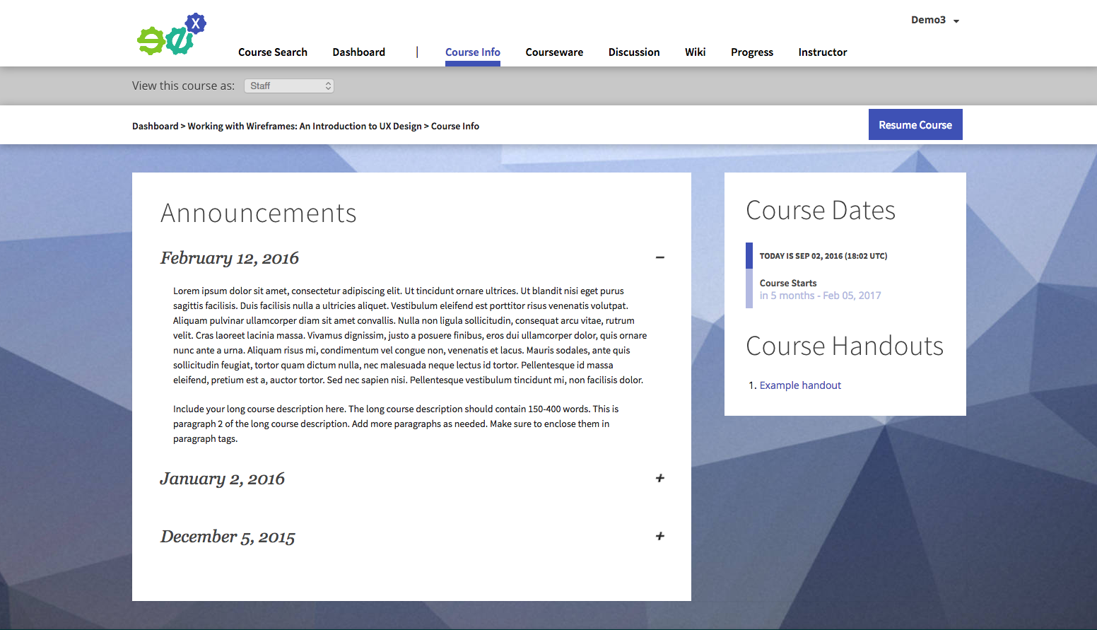
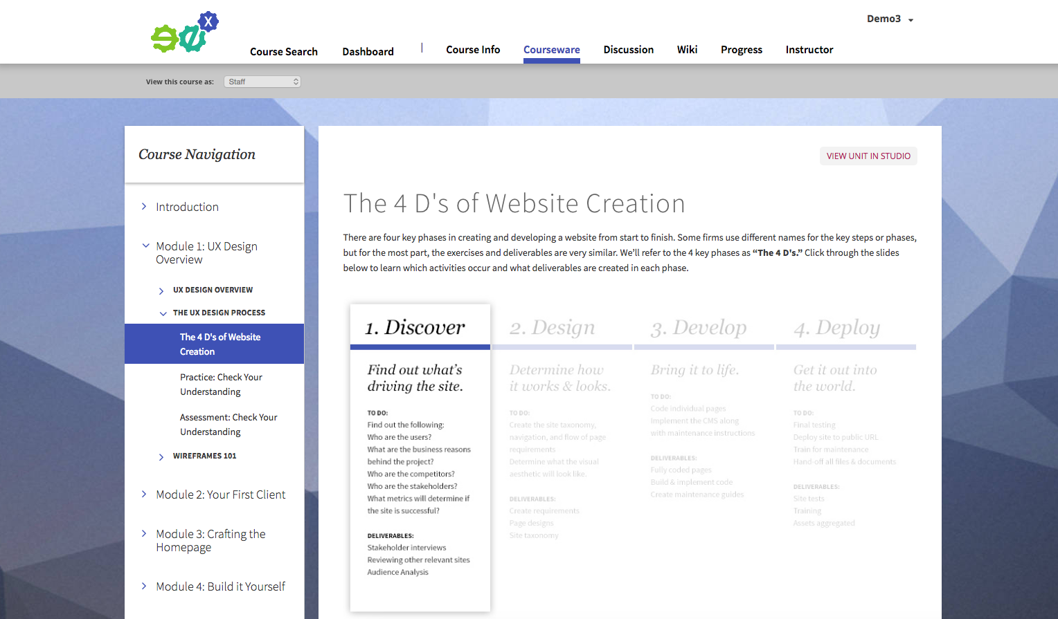
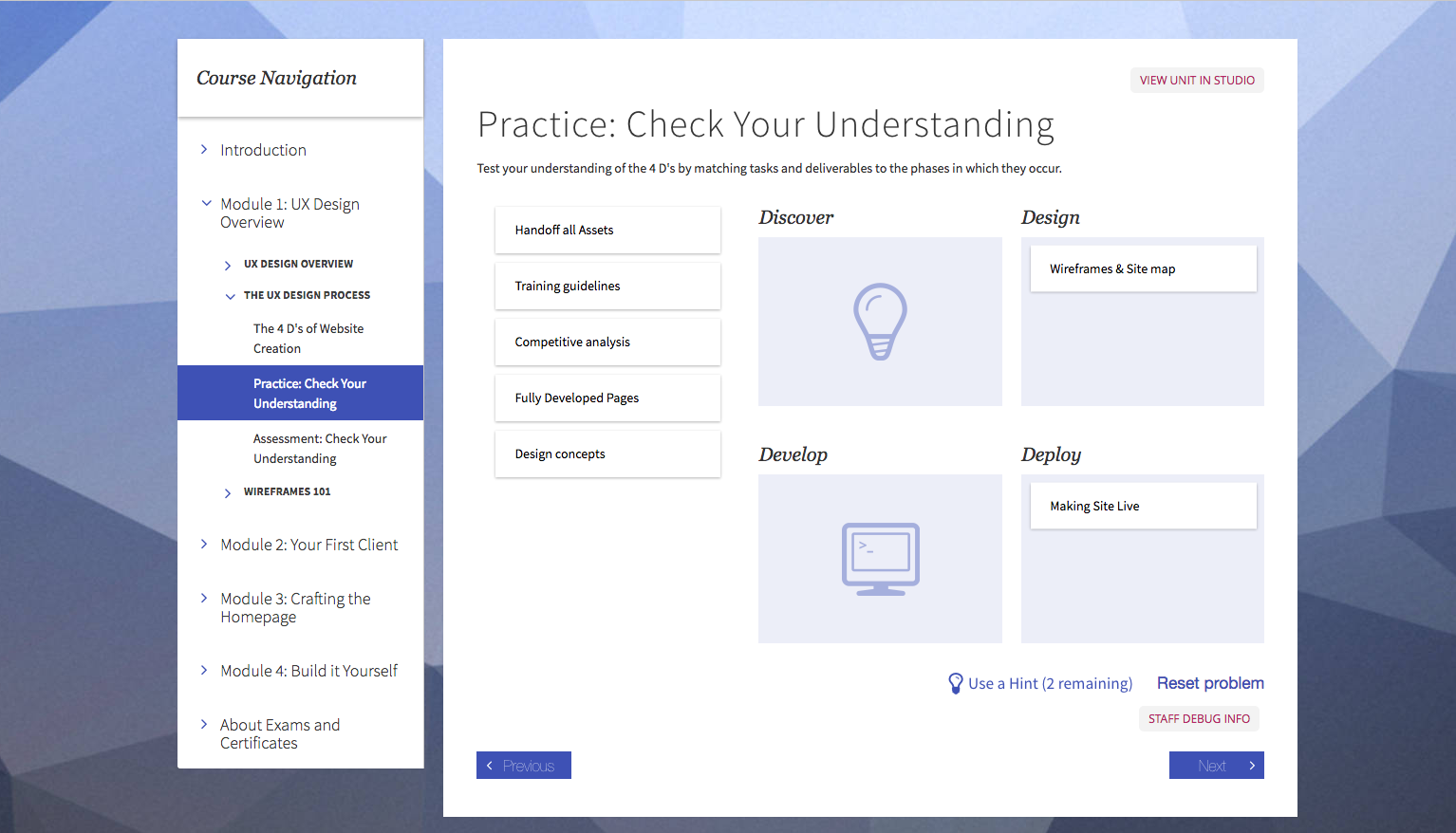
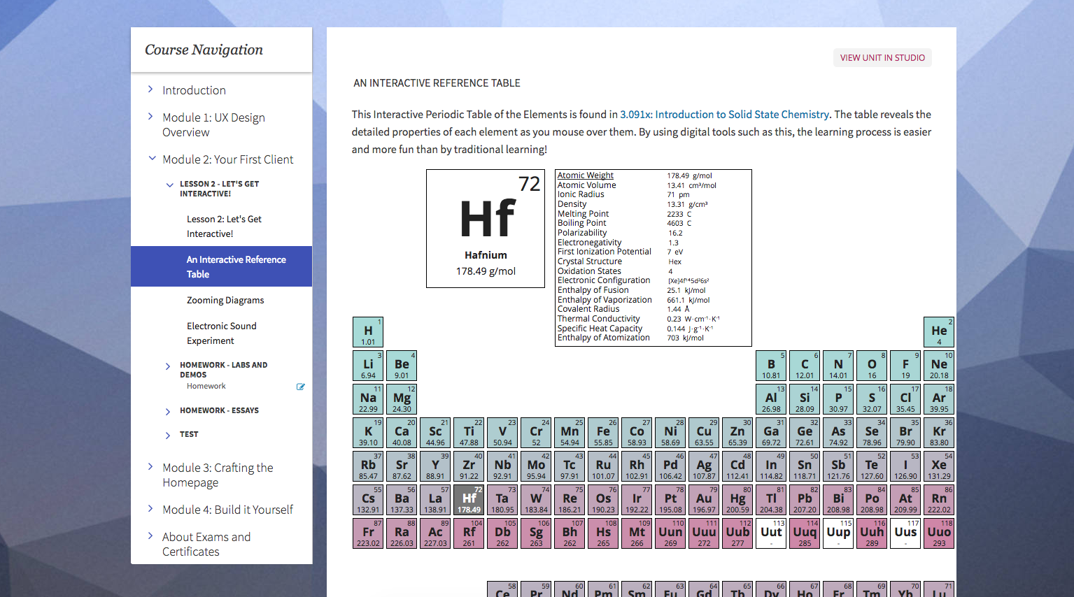
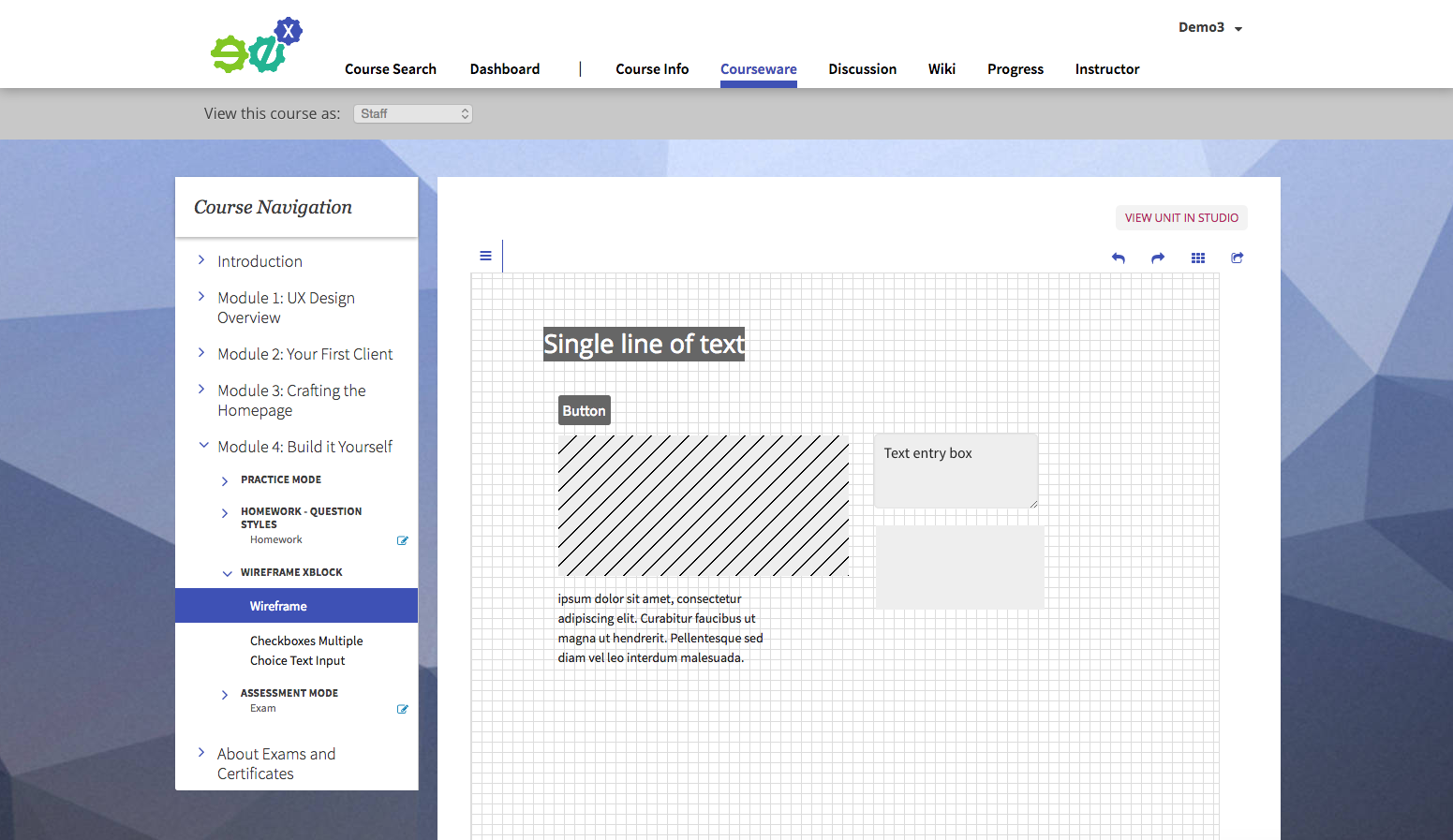
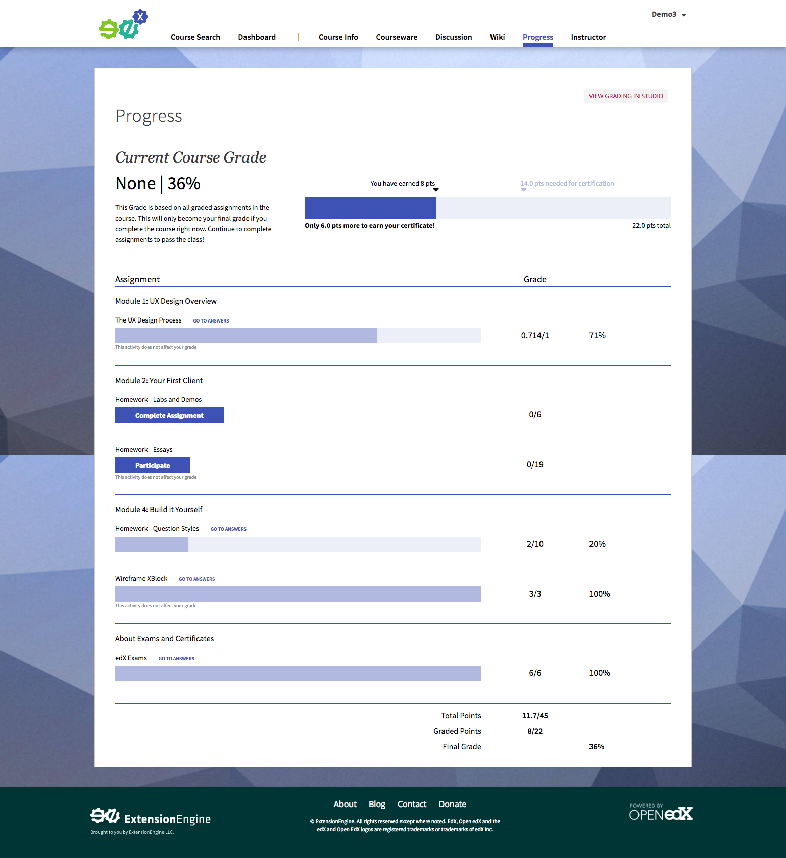
So what is a Custom Learning Experience? Below is an example from a demo we’ve created on Open edX, but it can be with any technology that fits you. We show the basics of what is possible with our team of instructional designers, project managers, UI/UX designer, developers, and your vision. With interactivity from custom drag and drop sections to creating a basic wireframing tool these examples are a few ideas we’ve come up with. We can change the navigation to what suits your content and your needs and still give you an intuitive admin panel to edit the content. If you want to learn more we’d be happy to help you.
Final Thoughts
Canvas and edX may have a linear flow, static content, and low customization level but those key ingredients are what help make them successful in creating MOOCs. They operate on a one-size fits most solution and they do it well. It’s easy create and post courses without the need for development. If that’s your goal then these platforms out of the box are the right fit for you. If you need something that is distinctively you, to set you apart from the other MOOCs, with your brand, and your vision Custom Learning Experiences are the solution.
Watch a live demo of ExtensionEngine's Custom Learning Experience built on Open edX narrated by our very own Dr. Scott Moore.


