Imagine that you’re a learner engrossed in an online learning environment. The content has completely captured your attention, and you’re excited to focus on something new and interesting. Then you get to this sentence:
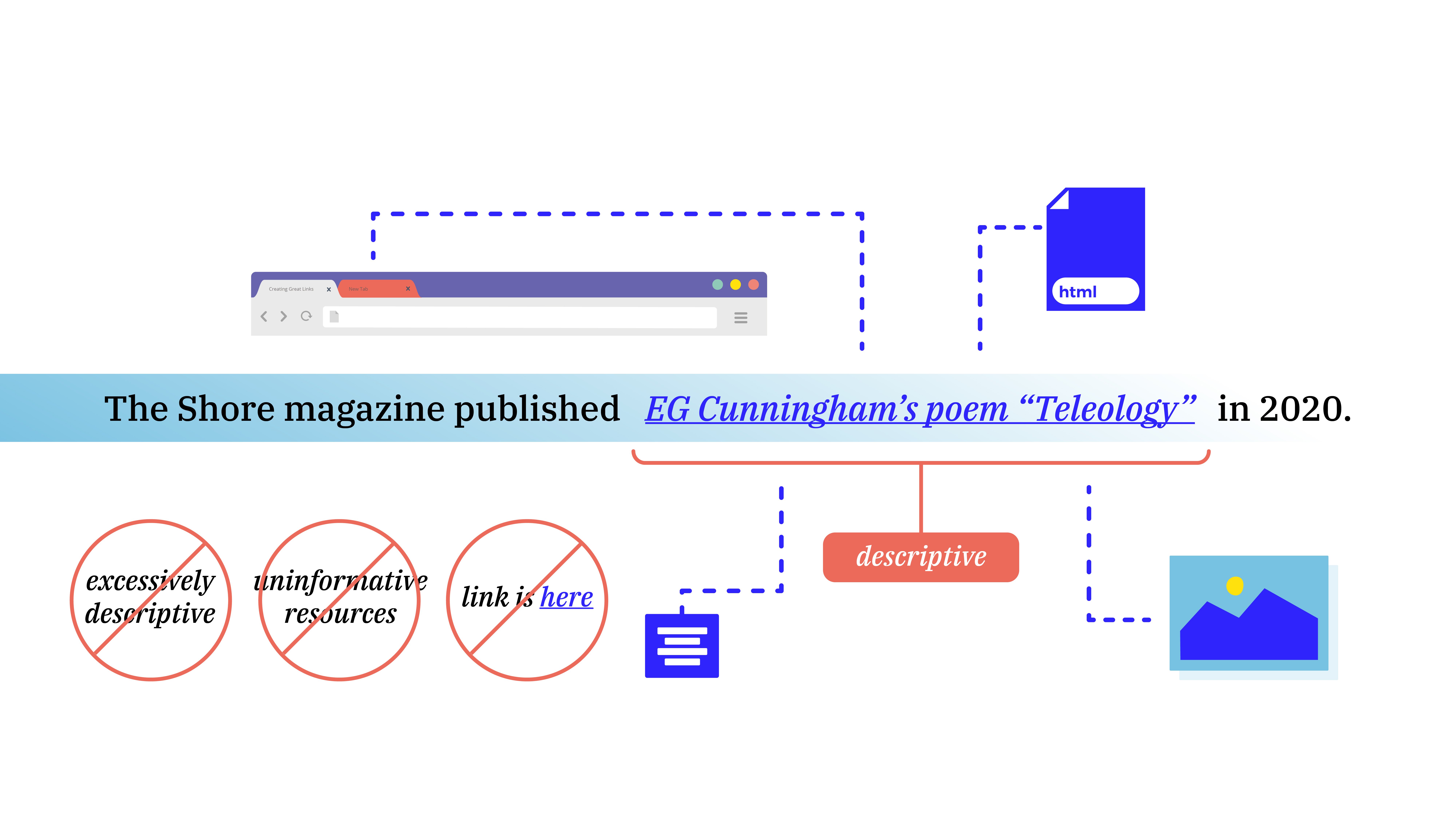
The Shore magazine published EG Cunningham’s poem “Teleology” in 2020: https://www.theshorepoetry.org/eg-cunningham-teleology.
As you read through the URL, your mind is pulled out of the flow of the content. You wonder whether you should keep reading or stop to follow the link. Compare that to seeing this sentence instead:
The Shore magazine published EG Cunningham’s poem “Teleology” in 2020.
The second sentence gives you the same information and takes you to the same place. But it manages to feel like an integral part of the content instead of stopping you in your tracks. Which sentence would you rather find?
When you’re online reading an article or taking a course, you will see links frequently. When done right, this feature fades seamlessly into the content while directing the reader or learner to additional relevant information. But when executed badly, links can distract and confuse instead. We often take that blue underlined text for granted, but it’s important to note that it takes effort to make these links effective and accessible.
Links as Accessible Educational Content
Links are how we connect to related content, provide additional examples, and expand on the context of information as we give it. Because links are such a common feature of all online content, it’s important to pay attention to how we present them to learners. We want every aspect of an online experience to engage students and make knowledge transfer as seamless as possible, including the links.
When we talk about creating great links, we mean much more than dropping in a URL. It may seem complicated at first, but there are a few simple best practices you can follow to improve the user experience and usability of the links in your online learning platform. You can make all of the information you present look and feel organic, like part of the text rather than tacked on.
What does "accessible" mean?
First, it’s important to clarify what we mean when we talk about accessibility in this context, and why it matters. We’re referring to how exactly you present your links, which we’ll discuss in more detail in the following sections. You want everyone to have a good experience in your online learning environment, including those with sight or hearing impairments. This allows the widest variety of learners to understand your content. Beyond the desire to be fair and inclusive, this type of approach is also an important part of complying with accessibility standards, which is key for organizations and institutions. Accessibility standards make it easier for all learners to get the most out of their educational experience.
Links should describe content
You should always use links with descriptive text, which makes them shorter and more readable for both sighted and sight-impaired learners, avoiding awkward URL addresses. This approach also presents the linked information as an outgrowth of the ideas being discussed so that it doesn’t seem like an aside. You don’t want your links to feel like footnotes, which people often skip over.
Hearing or listening to a sentence is much easier with descriptive text. It streamlines the online course experience and creates a comfortable reading environment, where the information flows rather than abruptly stops to take you someplace else.
What follows is a list of our top dos and don’ts for creating great links. Note that whatever approach you decide to take for your content, consistency is key. A consistent format allows students to know what to expect throughout their course experience. For example, clicking on any external link in the course should always take learners to a new tab. Keeping consistency in mind as you design will make it easier on your learners later.
Top 3 Dos
These are best practices that we recommend to make the most of your links:
-
Do compose the sentence so that it includes a reference to the location and, if relevant, the author of the source material you’re linking to. This makes the link descriptive and is also best practice for citations.
-
Do make sure external links (i.e., links to other websites) open in a new tab of the same window. This allows learners to explore the linked resource and then easily return to their course page without getting lost and having to press the “back” button or becoming confused by being in a new window and no longer seeing their course.
-
If you’re linking to an asset such as a slide deck or an image, do include a reference to the type of asset in the link itself. This lets the learner know what to expect and keeps them from being surprised if they’re asked to download something or open it in another program. Here’s an example of how this should look in your content:
For more information, follow these links:
-
-
Example Title 1(.pdf)
-
Example Title 2(.doc)
-
Example Title 3(.png)
-
Top 3 Don'ts
Now that we’ve looked at the dos, here are the key don’ts for creating links:
-
Don’t feel the need to be excessively descriptive in the text that’s included in the link. For example, look at the sentence “The Shore magazine published EG Cunningham’s poem ‘Teleology’ in 2020.” If the point is to link learners to Cunningham’s poem, does the linked section of text need to contain the words “Shore magazine published,” or can you just link the author’s name and poem title? Remember, unessential information included in link text can be distracting and make it harder to absorb essential information. In this case, it would be better to say, “The Shore magazine published EG Cunningham’s poem ‘Teleology’ in 2020.”
-
Don’t list resources without telling readers what they are, why they should care (if they don’t already know), and how to engage with them. Remember, an online experience should be as informative and engaging as a physical classroom. Just as you’d mention why resources matter in a physical classroom, make sure to explain it to your virtual classroom; e.g., write “Read George Orwell’s essay ‘Politics and the English Language,’ and be able to discuss whether you believe his rules for prose apply to writing poems,” not just “Politics and the English Language.”
-
Don’t use “here” with a link. You shouldn’t say “You can find the syllabus here.” because “here” is such a short word that it’s harder to see the actual link. Plus, for students using screen readers, links that are not descriptive make navigation unnecessarily difficult. This is because screen readers often navigate from link to link and ignore surrounding content, so a link that just says “here” is meaningless. Instead, the link text should be clearly informative, indicating where clicking on the link will take the learner; e.g., “The course syllabus outlines everything you need to succeed in this classroom.”
Great Links to Enhance Your Content
Let’s return briefly to our initial examples. With everything we now know, we could make that sentence serve its purpose even better if we rewrote it to read, “The Shore magazine published EG Cunningham’s poem ‘Teleology,’ which is a great example of free verse.” This version of the sentence follows all of our best practices. It’s accessible and will make sense when read by a screen reader, it is descriptive without providing unnecessary details, and it tells the learner why they should care about the link (assuming this is a class on types of poetry). As long as that link opens in a new tab, so learners don’t lose the original page, it’s a great link.