If you spend any time in the kitchen, you’ve probably seen the brand name OXO. This manufacturer creates a variety of kitchen tools and gadgets, from peelers to pans to coffeepots, and their products can be found everywhere you buy kitchen supplies. They’re one of the most recognizable brands on the market.
This level of recognition isn’t an accident; it’s the result of good design. OXO was founded on universal design principles. The stated goal of the OXO brand is to make your experience in the kitchen better through products that make your time preparing, cooking, and cleaning up easier, whatever the size of your hands, your grip strength, or how much weight you can lift. In other words, they want anyone of any ability level to be comfortable using their products.
Extension Engine obviously doesn’t make spatulas or potholders, but we’re fascinated by good design wherever it’s found. When we talk about the idea of universal design for the web, one thing we’re talking about is digital accessibility. The more that people are online, the clearer it is when particular online spaces aren’t built with everyone in mind.
What is digital accessibility?
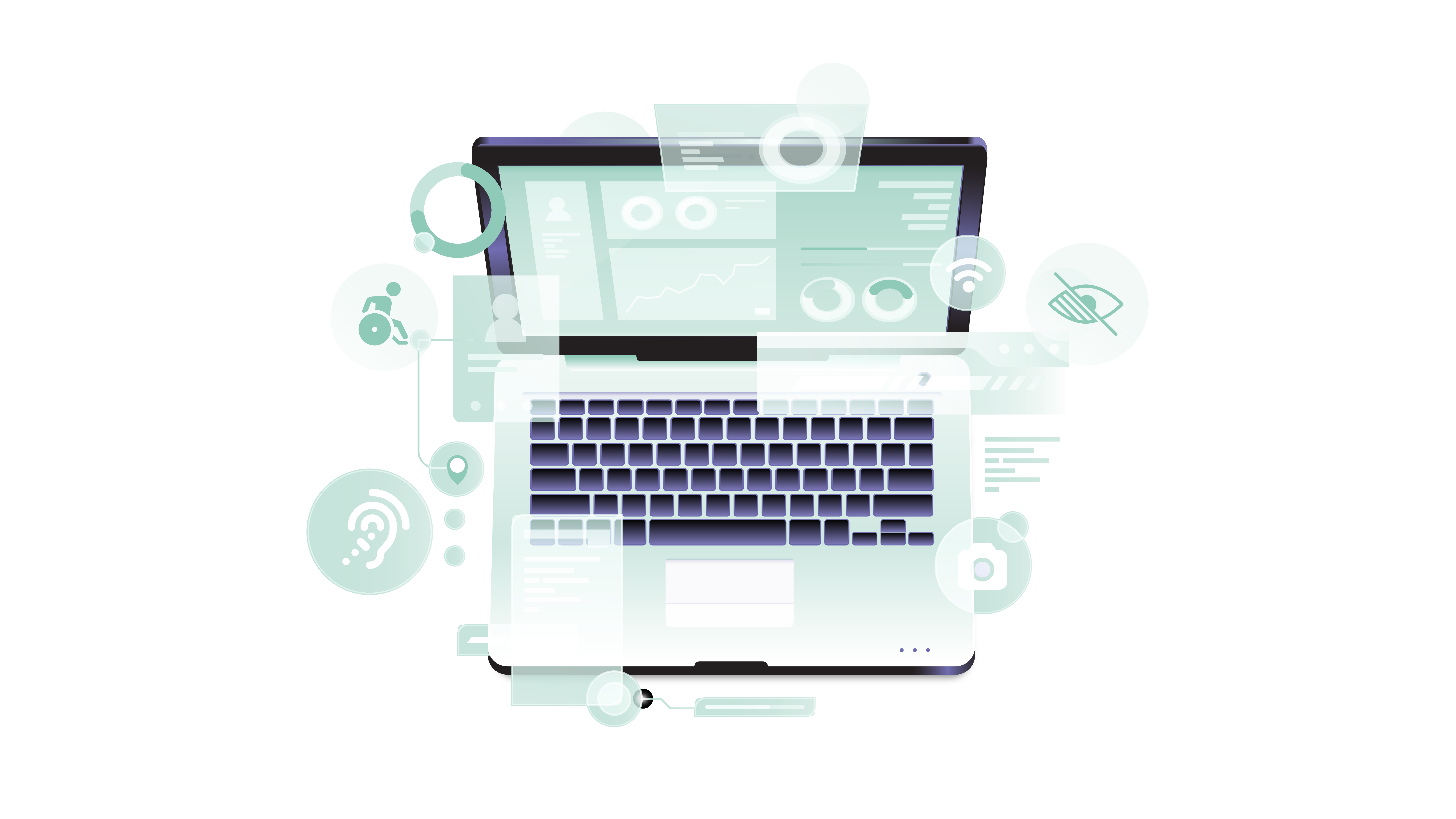
The term “digital accessibility” refers to the idea that websites, apps, tools, and technologies built for online use are designed and developed to be used by anybody, regardless of their abilities or disabilities. The term doesn’t just apply to the websites themselves.
Say you’re a web or app designer starting a project. There are multiple components to consider besides accessibility, so for many people, it becomes an afterthought. Depending on their audience, designers may remember that they’ll need text-to-speech screen readers, for example, or that using too many long blocks of text on a page can be confusing. But their efforts may stop there, and true accessibility is much more than that.
If you want to welcome everyone into your online space, you don’t want it to be difficult or confusing to navigate. But that’s the bare minimum. Beyond that, you want people to see themselves respected in your space’s content and in the community you’re creating through it. To that end, you must be deliberate and careful with the accessibility practices you choose to follow.
What are some best practices for digital accessibility?
The goal of digital accessibility is to make your content simple and comfortable to use for the most people possible. Some things to bear in mind as you begin include:
- Your user may have a permanent disability (e.g., a missing limb or macular degeneration) or a temporary disability (e.g., a broken arm or lost glasses).
- Your user may be experiencing normal aging that affects their ability to interact with a screen.
- Your user may have a slow internet connection.
- Your user may be experiencing a situational issue like sun glare off their screen or an unusually loud environment.
Each of these circumstances would require different solutions if you were designing something on the fly to fix a problem. But wouldn’t it be better to address these things before they inevitably occur?
This is far from an exhaustive list, but we can broadly group disabilities into five categories that can and should be addressed through best practices in digital accessibility:
- Speech. For example, a person who has trouble speaking would not want to have to call a phone number to contact a company for troubleshooting. Making site support available through text chat or email is a good solution.
- Hearing. Transcripts and captions are a good option for people who can’t hear well enough to listen to audiovisual media.
- Vision. Most people think of text-to-speech screen readers, but those with visual impairments can also benefit from options such as the ability to enlarge text and images.
- Cognitive/neurological. It can be difficult for some people to process large amounts of text or text presented in complicated layouts. The simplest solution is to break text up and create a clear visual hierarchy that isn’t totally reliant on color.
- Physical. Some people have trouble using a cursor, so an option to navigate through a site using only the keyboard is important for them.
What if I don't improve my company's digital accessibility?
One consequence of poor digital accessibility you may see in the news is large companies and education providers being sued for their bad practices. These types of lawsuits have been on the rise recently, and they often take the form of civil rights complaints. Even universities such as Harvard, MIT, and New York University have had to resolve complaints made against them based on the inaccessibility of their information technology.
Of course, this isn’t the only reason to care about digital accessibility. If you’re concerned at all about increasing access to the information you’re sharing and keeping your design practices cutting-edge, and if you want to build up your user base and explore new market opportunities, you should strive for accessible and equitable design. Your future success depends upon it.
Extension Engine is always working to improve ourselves and our processes in this regard. We look for both known and emerging knowledge about best practices to make sure that our own site and all of our clients’ sites meet high standards for accessibility and inclusiveness. As a part of our process, we regularly conduct accessibility reviews on our projects with the goal of building accessibility into all of them from the start. In addition, we seek to constantly learn more by sending our learning experience (LX) team to attend the Design + Diversity Conference, which uses a series of sessions, keynotes, and social hours to explore proactive ways to increase the diversity and equity of the design and creative industries. In these ways, we place our energy and effort into creating high-quality, accessible learning experience designs for our clients every day.
