Every so often, we are presented with a project that not only offers the challenge we thrive on but that also has the potential to do exceptional good in the world. We recently completed one such project for Foundation Medicine, a molecular information company “dedicated to a transformation in cancer care in which treatment is informed by a deep understanding of the genomic changes that contribute to each patient's unique cancer”.
Foundation Medicine conducted a study that was featured in a journal article in the American Association for Cancer Research and highlighted in an address during the Precision Medicine Initiative Summit held at the White House in February of last year.
The study involved a genomic analysis of cancer cells from over 1200 pediatric patients, ages 0-18, that produced an enormous amount of data. Foundation Medicine wanted to find highly visual and interactive ways of presenting this data so that cancer researchers could use it to pursue new lines of inquiry into pediatric cancer treatment based on genomic information.
Effectively teaching people how to act on data requires expertise in data visualization, creating software that helps people understand the significance of the data by placing it in a visual context. Patterns, trends and correlations that might go undetected in text-based data are revealed and more easily recognized using data visualization software.
It makes sense to approach cancer research from this angle. After all, cancer begins when a gene within a cell alters in such a way that the cell begins to reproduce uncontrollably. In the absence of technology to take a closer look at the genetic side of cancer, treatments came to be limited to surgery, radiation, and chemotherapy. These are still the most common cancer therapies.
The ability to peer inside a cancer cell’s DNA to figure out what went wrong to begin with presents an opportunity to discover and develop entirely new approaches to treating cancer. The importance of Foundation Medicine’s dataset cannot be overstated, data that the organization wanted to make available to pediatric cancer researchers at no charge.
The dataset includes:
- 1208 unidentified pediatric patients
- Ages 0-18
- Six types of solid cancers, each with its own subtypes — over 50 different types of cancer in all
- Over 50 different genes found to be involved in pediatric cancer
- Seven different types of alterations that can occur in these genes (plus unknown variants that may or may not be implicated in cancer)
- Information on the prevalence of each alteration in each gene across the samples
- Information on co-occurrence (genes and alterations found within the same sample)
This is a mind-boggling amount of data. Our challenge was to make this dataset accessible in a highly usable and scalable format so that researchers could analyze overall patterns in the big picture, zero in tightly on a specific alteration/gene/cancer/age, or anything in between. Flexibility to move around within the dataset was key, as no one knows what secrets the data hold about pediatric cancer or exactly where these secrets will be revealed.

To meet this challenge, ExtensionEngine designed an interface that is simple, clean and intuitive while affording researchers the ability to drill down as deeply as needed. Users access information by choosing one of three viewing modes:
- Overview
- Prevalence
- Co-occurrence (gene alterations that occur together)
A “disease tree” runs down the left side of the screen where researchers can filter the results, depending on the mode. Choosing a filter ripples through all the modes.
Because the information revealed in each mode is distinctive, the graphics vary accordingly to present the data in the most understandable way.
- The Overview presents data about cancer type in two pie charts: samples and genetic alterations. Filters include cancer type/subtype and age; the user drills down by clicking on slices of each pie.
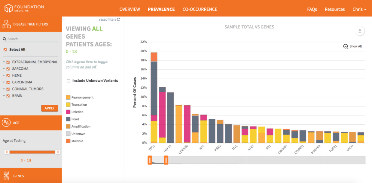
- The Prevalence mode is a stacked bar graph showing the percentage of samples in which genetic alterations appear. It can be filtered by cancer type/subtype, age, and gene. Clicking the legend allows researchers to eliminate alterations to focus more tightly on those of interest.
- The Co-occurrence mode is a plot chart that displays the genes involved in every single one of the 1200+ samples. Hovering over a data point produces a popup that reveals the “protein effect” (genes affect proteins, which carry out cell function), the gene involved, the alteration type, and the disease. A zoom feature allows the user to isolate any individual sample.
Behind the scenes, of course, is a significant amount of binary crunching. If you’d like to see how all of this works, you can do so by signing up for a free account at the Pediatric Portal. The data is available to anyone seeking to view it. Feel free to click around. It’s simple, intuitive and interactive.
With the fight against cancer being the new moonshot, we are proud to have been a part of this effort. The data visualizations in the Pediatric Portal are expected to hold the key to new approaches in treating children’s cancers — and maybe even curing them.